Payl - where you keep your digital receipts
Payl
PO and UX/UI Lead
Project type: —— Execution time: 4 months
Quick summary: Payl is a startup with the POC that we need to reinvent the old-fashioned
receipt and bring value back to it. Powered by machine learning, scan with OCR (Optical character recognition) and with data extraction interpret physical receipts, then convert them into a digital format.
The problem: The product's technology is innovative and routes from a real-life vexation and curiosity about why we have paper receipts. But the question still stands. Why would users invest and use this technology? And for what? How do we create a product that users are willing to change or add to their everyday lifestyle?
Goals
Create a user-friendly interface that gives value to the product.
I am aware of the broad and vague goal and difficult to test. But, when I first started, the company was very much in the early stages of creating the product.
Sub-goals-
Because Payl is a startup, the MVP was not clearly defined yet. This is why it became one of my goals. To establish an MVP by clearly stating a version of Payl with just enough features to be usable by early customers who can then provide feedback for future product development.
-
When I stepped into my role at Payl, the app was not yet released. One of the evident goals was to create a release-ready design. That we, later on, could improve on.
-
When the first two goals got reached, I started to explore additional paths and approaches to Payl's evolution. To establish innovation and show investors and stakeholders what Payl had to offer them and the user.
THE DESIGN PROCESS.
Early ideation
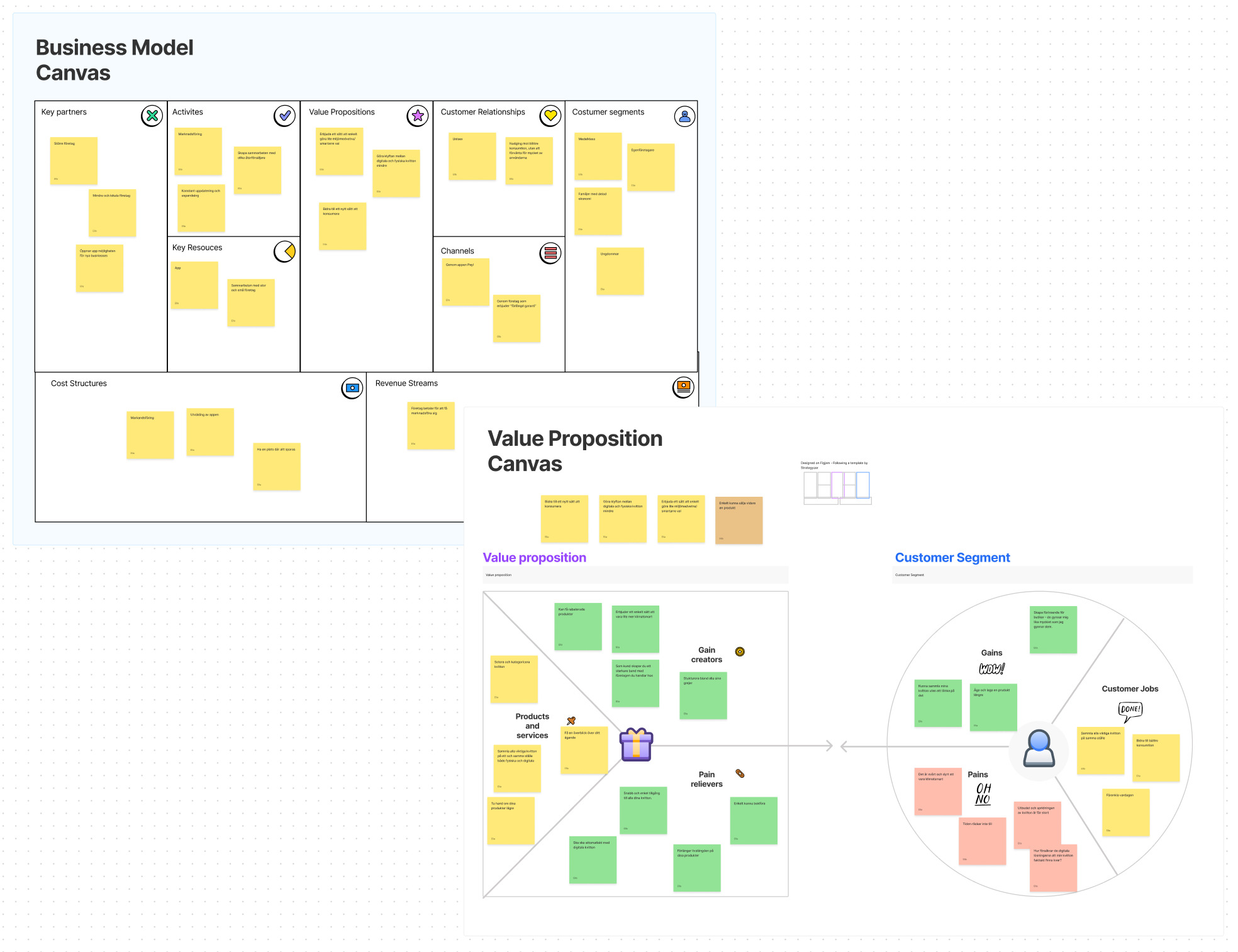
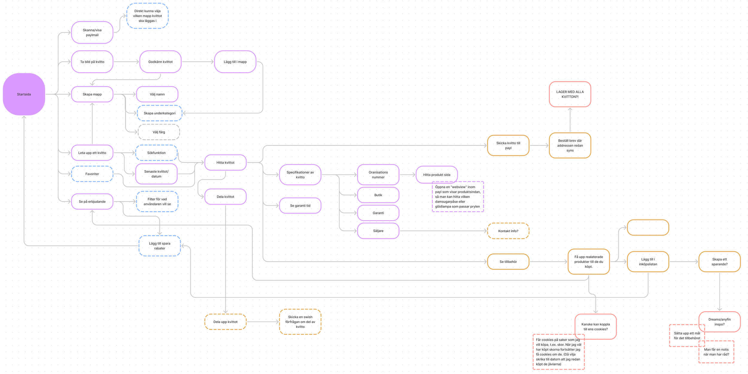
My first goal and point of action were to find Payl's MVP. Even tho we had a great idea, it doesn't necessarily mean that you have a good business plan. Once your idea meets the world it will encounter customers and if they do not care about the problem your idea is solving it is game over. That's why I decided to start by doing a Bussines model canvas. Some of the key points we found were:
Our customer segment is broad
We had opportunities to collaborate with some bug key partners
Some aspiring value propositions
We could see that the key points are significantly specific. I believe it's a consequence of the company is young and is still trying to find its window of opportunity.
To straighten our value proposition, I conducted a Value proposition canvas, identifying different gain creators, products and services and pain relievers. Matching that up with the customer segment consisting of gains, pains and customer jobs.
Then present it to the whole team. The results form the Bussines model and Value proposition canvas as the starting point of discussions and a workshop.
This resulted in our MVP - (at the moment) being:
We believe that users have an interest in keeping track of their buying habits.
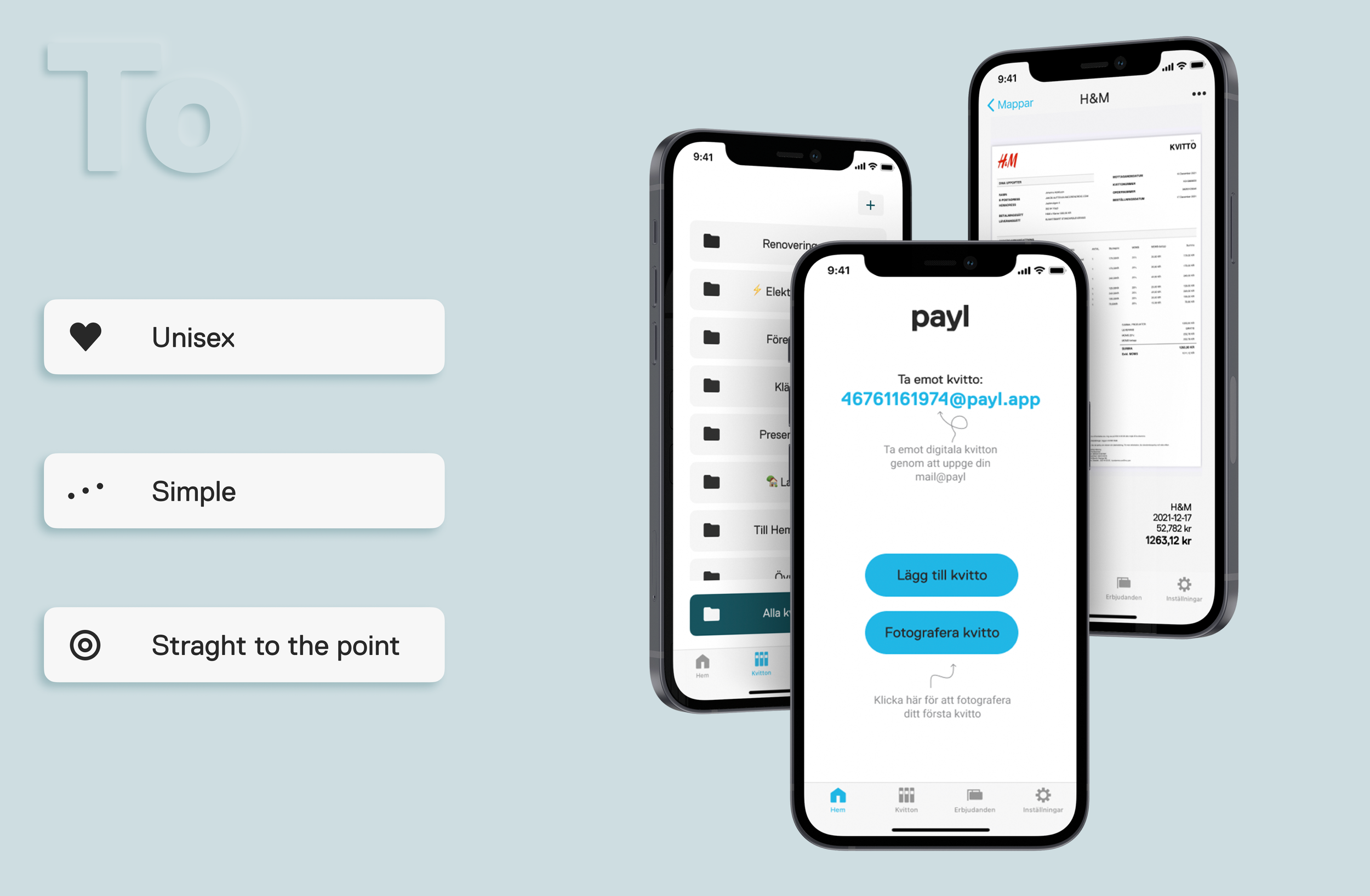
The second sub-goal is to create the look and feel of the app. In a workshop, we settled on some keywords that Payl should reflect in the design.
Unisex
Simple
Straight to the point
We decided on these guidelines because I believed that the user needed to create a new habit in their everyday life. In conclusion, we needed to develop something simple to understand and won't take up much of the users' time.
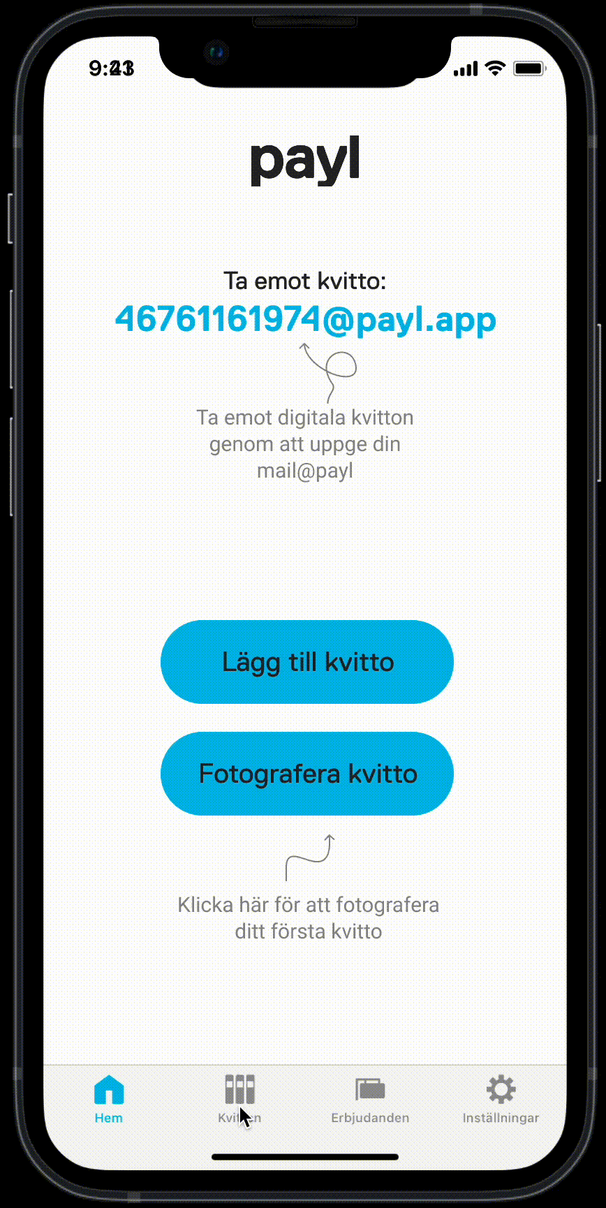
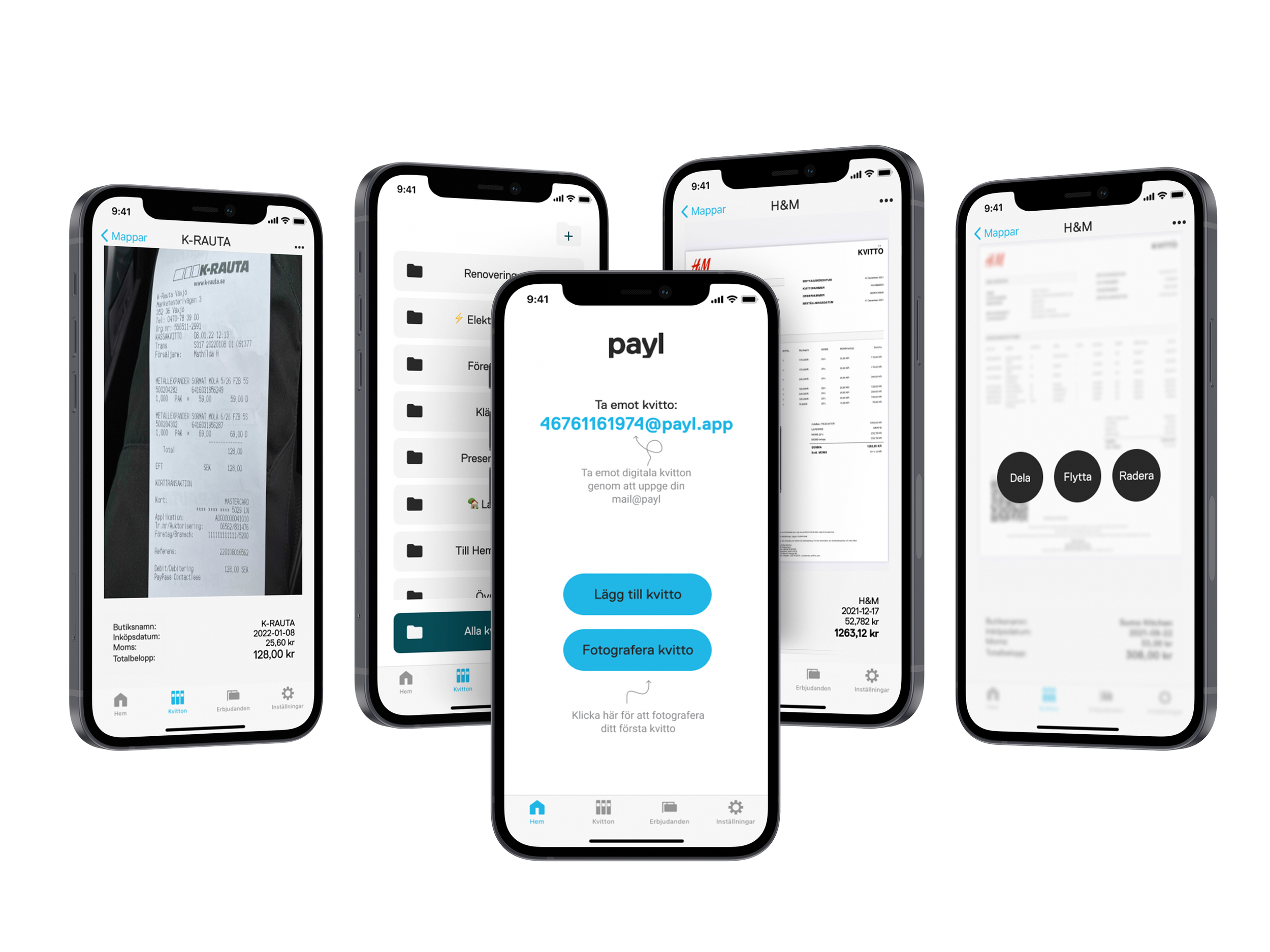
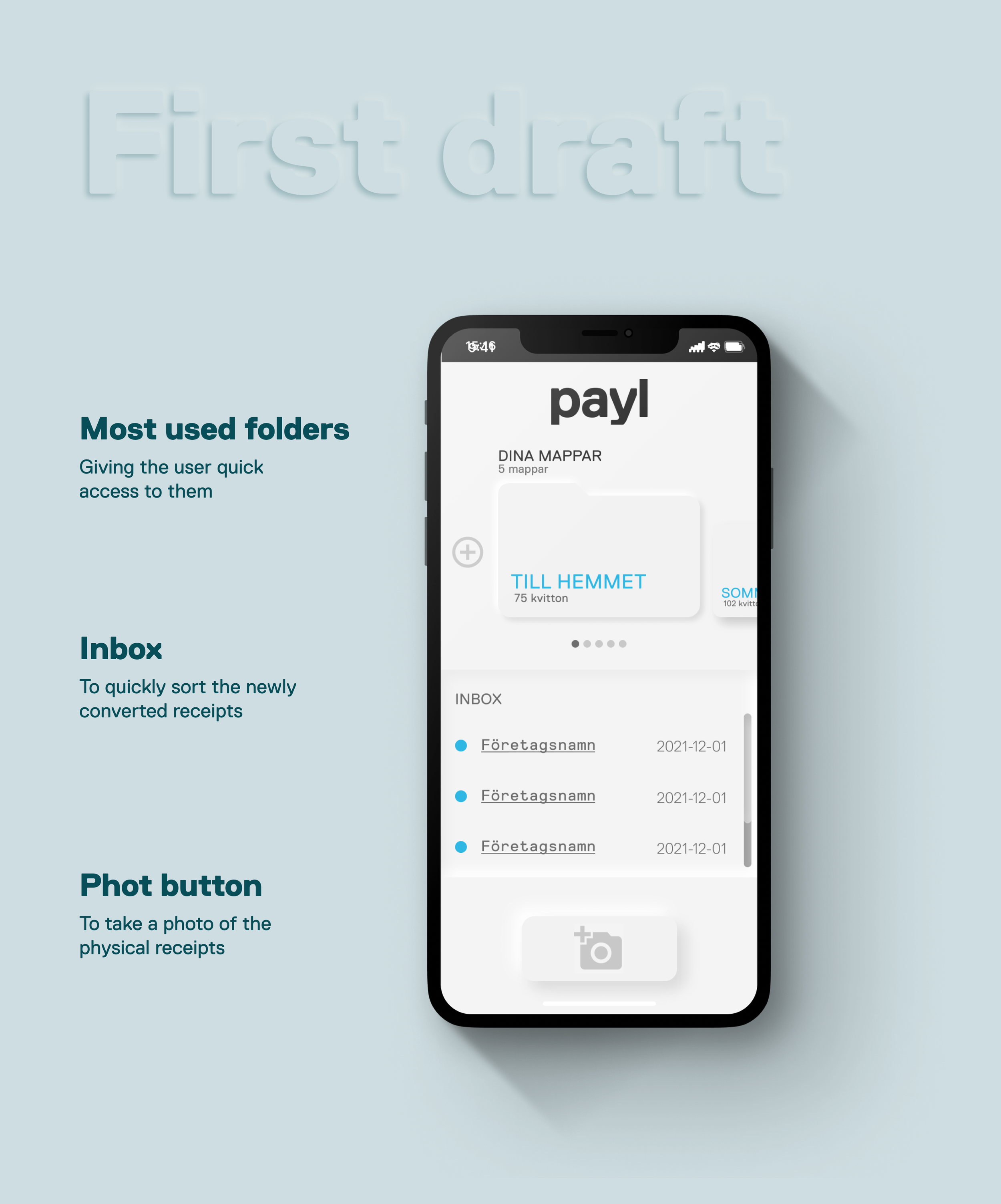
In my first design, I focused on reducing the users' requirements to navigate and understand the app. Like I said before, I wanted to reduce the time required to spend on the app. Therefore, I designed it in a way that most functions were reachable from the first landing page. Creating a sorting and structuring system. It would help the user to sort their receipts.
I brought everything to the first screen. Giving the user quick access to its most used folders of receipts. An overview of the inbox for easy access to quickly sort the newly converted receipts.
Last but not least, a button for the user to take a photo of the physical receipts that they get throughout the day. With an easy to reach position.
This first iteration sparked an endless discussion within the company about the different directions we could take. Questioning what features are most important and relevant for the users to access. I then decided to simplify the first home page even more and strip it from excessive functions, leading to the end design.
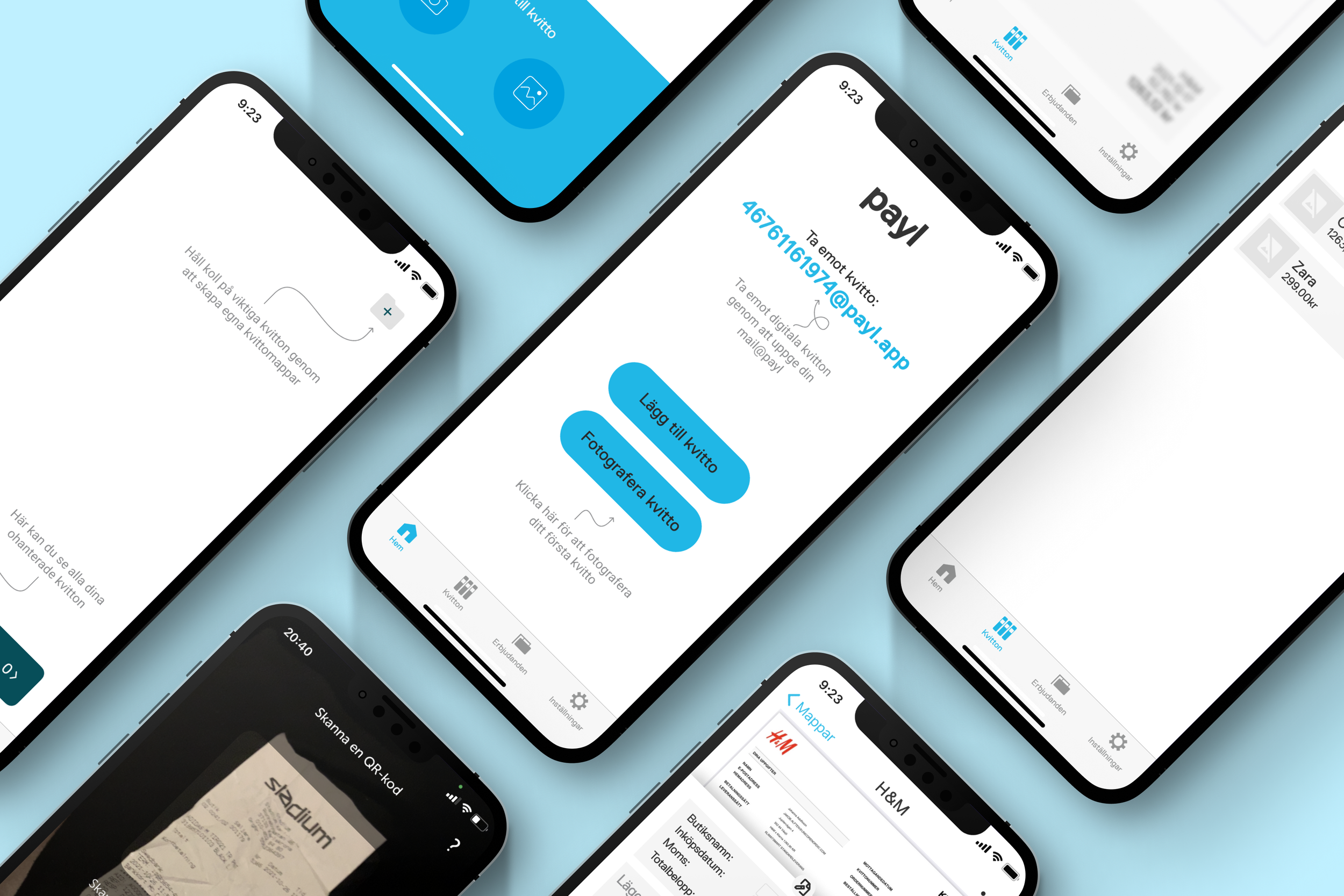
I had now created a launch-ready design